[Eng / ไทย]
How did I learn to set my own color palettes from Leh-Ladakh, Delhi and Agra.
มาดูกันว่าเราเซ็ตชุดสีจากทริปอินเดีย (เลห์-ลาดักห์ อัครา และเดลี) ครั้งนี้อย่างไรบ้างค่ะ
[1]
Pashmina shawl


In my previous blog post some of you may noticed that I used different color palette from my usual works. Normally, black from graphite or ink, blue from pen or just any simple one color from colored pencil box are my first choice when I do some quick sketches. However I chose the set of blue, red, yellow, orange, pink and grey on purpose.
These colors were taken from the color pattern on pashmina shawls that I brought in Leh. The colors on shawls have much more gentle tone because each color was dyed from plant. Actually I am still curious about how was that old rose color came from.
ในบล็อกก่อนหน้านี้หลายท่านอาจสังเกตเห็นว่าเราใช้ชุดสีที่แตกต่างไปจากการสเก็ตซ์งานปกติ(ซึ่งใช้สีไม้สักหนึ่งหรือสองสี ใช้ดินสอหรือปากกาหมึกดำหรือน้ำเงิน หรือบางทีก็แค่พู่กันจุ่มหมึกดำเพียงอย่างเดียว) ในบล็อกนี้เราขอเฉลยค่ะ ว่าชุดสีเหลือง แดง ฟ้า ส้ม ชมพู เทา เหล่านั้น เราได้มาจากผ้าพันคอแพชมินาจากเลห์ – ลาดักห์เหล่านี้ค่ะ


This is my rough color chart. Trying to make the colors close to the original one.
นี่เป็นชาร์ตสีที่ทำขึ้นมาอย่างง่ายๆ ใช้สีไม้ Caran d’ache + Staedtler + Faber Castell ค่ะ ได้โทนสีใกล้เคียงต้นแบบอยู่เหมือนกัน

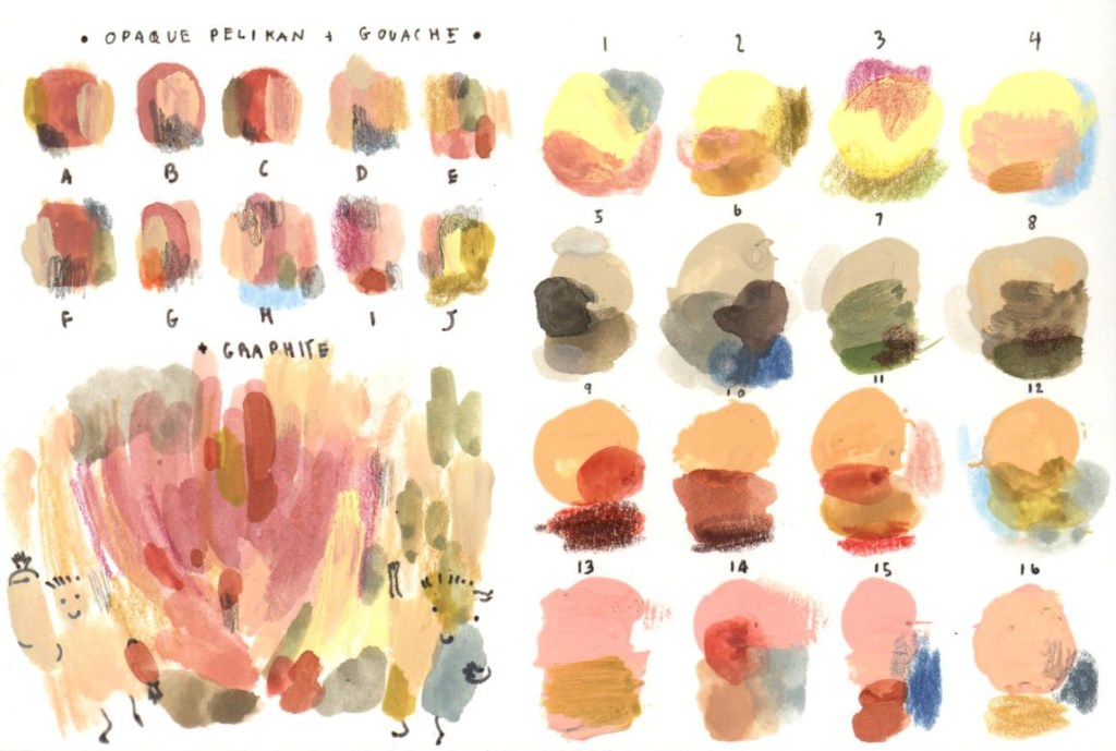
The pigment from both Caran d’Ache and Faber-Castell are fine, but to give another sense of Leh-Ladakh in my memory I think it would be nice to add some earth tone colors from different medium such as Opaque Colors or Acryla Goauche. The upper left picture is the example of Pelikan Opaque painting that I had done many months ago. Look at the messy palette, there are perfect earth tone colors that I want! The upper right and the pictures below are the rough color chart that I did after went back from Leh. I will use mixed colors from both of my first and second charts in my next palettes. : D
แต่เนื่องจากว่าเลห์-ลาดัก มีความเป็นเอิร์ทโทนมากอยู่ (อย่างสีจากผ้าพันคอที่เห็นข้างบนก็เกิดจากการย้อมด้วยพืชทั้งนั้นเลย) การใช้สีสดใสจากดินสอไม้เพียงอย่างเดียวไม่น่าจะพอ ที่ผ่านมาเราเคยใช้สีจากพิลิแกนดังภาพซ้ายบน ซึ่งจะมีความขุ่นและให้อารมณ์ดินๆ ชุดสีที่เราเคยผสมเอาไว้คิดว่าเหมาะมาก เราเลยจัดการเอามาไล่เฉดกันใหม่ค่ะ ได้ออกมาเป็นภาพขวาบน และภาพชาร์ตสีด้านล่าง นอกจากนี้ยังคิดเอาไว้ด้วยว่าถ้าบวกสีจากสี Gouache ที่มีความพาสเทลนิดๆ เข้าไปอีกก็น่าจะเยี่ยมไปเลยนะ


It’s totally look like the same color palettes as these pashmina shawls.
ทีนี้เลยลองเอามาเทียบกับเฉดสีจากผ้าพันคออีกเซ็ตหนึ่งจากเลห์-ลาดักห์เหมือนกัน ปรากฏว่าใช้ได้เลย


[2]
Wes Anderson’s color palettes
Sometimes in Leh, you will find the perfect color set from indoor market.
สองภาพข้างล่างนี้ถ่ายจากตลาดในตัวเมืองเลห์ค่ะ นึกถึงแกรนด์ บูดาเปสต์ โฮเทล ของเวส แอนเดอร์สันขึ้นมาทันที ได้ภาพมาแล้วก็สามารถแปลงมาเป็นชุดสีของตัวเองได้เลย


It was and it is so much fun to do this kind of experimental color palette. If I don’t stop after completing this one, I won’t finish this blog post writing.
ได้ออกมาเป็นชุดนี้ค่ะ ได้ความพาสเทลจาก Gouache มาผสม ซึ่งทำให้สามารถแตกแขนงชุดสีออกไปได้ไม่จบสิ้น ทำเพลินจนเกือบจะเขียนบล็อกนี้ไม่จบแน่ะ
[3]
Sunshine
Everything got clearer under the sunshine even with the earth tone colors!
The days of brightness and splendor!
The color palatte is almost the same as the previous one, the differences are the brightness and the sky color.


ช่วงที่เราไปเลห์เป็นช่วงปลายกันยา – ต้นตุลาค่ะ อากาศยังอุ่นในช่วงกลางวัน และตกราวสามองศาในช่วงกลางคืน กลางวันถือว่าแสงแดดจัดมาก จริงๆ ภาพชุดนี้เป็นโทนเดียวกับชุดสีพาสเทลในข้อ [2] เลย เพียงแต่แดดทำให้เฉดสีเหล่านั้นสว่างและสดใสขึ้นค่ะ
[4]
Colorful sarees (and other colorful things) at Agra and Delhi

I was fascinated by sarees. I took a lot of pictures when I saw women wearing these beautiful clothes. There were endlessly color matching patterns and marverlous details. Pink was like ‘very very pink’ and it was contrasted by this brilliant turquoise. The flowers bloomed in various shapes and forms. I was overwhelmed.


I think I can just close my eyes and point my finger to any two circles and then I will get my color palette!
เราชอบส่าหรีมากเลยค่ะ ไปอินเดียครั้งนี้ก็ถ่ายไว้เยอะมาก แต่ส่วนใหญ่จะถ่ายแบบชัดๆ ได้ที่อัครา เพราะว่ามีพื้นหลังเป็นหินอ่อนทำให้เฉดสีของส่าหรีทุกเฉดดูได้ง่ายขึ้น ผ้าแต่ละผืนนี่ตัดสีกันได้สนุกมากๆ เราประทับใจความชมพู๊-ชมพูที่ตัดกับสีเทอควอยซ์ของชุดหญิงสาวในภาพแรกเป็นที่สุด อีกทั้งลวดลายดอกไม้ของผ้าแต่ละผืนก็ดูกันได้ไม่เบื่อเลยทีเดียว อย่างในวงกลมที่เห็นข้างบนก็เป็นส่าหรีส่วนหนึ่งที่ถ่ายไว้ภายในทัชมาฮาล เราว่าถ้าคิดอะไรไม่ออก แค่หลับตาจิ้มๆ ก็ได้คู่สีสนุกๆ มาวาดแล้วค่ะ : D
Most of these saree photos were taken from Taj Mahal, Agra. It was much more easy to absorb this kind of atmosphere when having some white space of marble stone as background. At Delhi, I could not took many photos of saree so I brought the real sarees instead. They are beautiful, aren’t they?
ข้างล่างนี้เป็นส่าหรีที่เราซื้อจากซุปเปอร์มาร์เก็ตในเดลีค่ะ กำลังกระหน่ำลดราคากันอยู่เลย เนื้อผ้าค่อนข้างแข็ง (ทำให้ราคาไม่เกิน 350 Rs หรือไม่เกิน 182 บาทไทย) แต่ลวดลายสีสันนี่น่าประทับใจมาก คลี่ออกมาแต่ละผืนนี่เหมือนกับได้ดูหน้ารองปกของหนังสือภาพสวยๆ เลยค่ะ


On saree you will see these hand painted ceramic knobs. My brother got them from a small grocery shop in Delhi. This grocer’s shop sold tea, spices, perfume, Himalaya products and… this lovely knobs! What a wonderful grocery shop!
บนส่าหรีที่เราซื้อมา สังเกตเห็นอะไรเล็กๆ น่ารักนั่นไหมคะ มันคือมือจับบานตู้ที่ทำจากเซรามิกนั่นเอง พี่ชายเราไปเจอในร้านขายของชำที่เดลี ซึ่งสำหรับเราเป็นร้านที่แปลกมาก(ในทางที่ดีนะ) เพราะคุณลุงเล่นขายทุกอย่างเลย ตั้งแต่ชา เครื่องเทศ ขายสบู่ แชมพู น้ำหอม แล้วก็ยังมีมือจับแบบนี้ขายอีกด้วย ซึ่งราคาถูกมากจนน่าตกใจ(เอาเป็นว่าใน etsy ขายแพงกว่าที่คุณลุงขายเกิน 100% แน่นอน) สีสันเพ้นท์ด้วยมือบนเซรามิกเหล่านี้ก็เป็นอีกหนึ่งชุดสีที่เราชอบค่ะ


The photos above are the marble stone – craft of Agra. The artisans get various colors from carnelian, malacite, lapis lazuli, turquoise, coral, granite, black onyx, jasper , etc. Each ornament reminds me of Indian women wearing colorful sarees at Taj Mahal.
ที่เห็นข้างบนนี้เป็นงานฝีมือหินสีฝังหินอ่อนจากอัคราค่ะ สีสันสวยงาม ลวดลายแต่ละอย่างก็ชวนให้นึกถึงผู้หญิงใส่ส่าหรีที่อัครา ทีนี้ก็มาดูกันค่ะว่าชุดสีที่ได้จากทั้งหมดนี้หน้าตาจะออกมาเป็นอย่างไรบ้าง
And here is my messy color palette.
ออกมาค่อนข้างจะยุ่งเหยิงลายตาเลยทีเดียวค่ะ : D


On my next blog post, I’ll come up with using these color palettes on my new illustrations.
บล็อกหน้ามาพบกันใหม่ค่ะ มาลองดูว่าเจ้าสีทั้งสามเซ็ตนี่จะถูกนำไปใช้กับภาพประกอบได้อย่างไรบ้างนะคะ : )
Thank you!
: D
****

Leave a comment